Meet Libby. The one-tap reading app from OverDrive. By downloading Libby to your smartphone, you can access thousands of eBooks and audiobooks from your library for free anytime and anywhere. You’ll find titles in all genres, ranging from bestsellers, classics, nonfiction, comics and much more. Libby works on Apple and Android devices and is compatible with Kindle. All you need is a library card but you can sample any book in the library collection without one. In select locations, Libby will even get your library card for you instantly. Learn more at https://meet.libbyapp.com/. Happy Reading. Time for an easy Read Harder challenge: read a book with a cover you hate! Since this is such a subjective challenge, you could technically read any book and just argue that you dislike the cover for insert arbitrary reason here. But there’s a lot of hilarity and bookish discomfort in bad covers, so I hereby give you permission to have some fun with this challenge. Here are a few of my least-favorite favorites:
The Handmaid’s Tale by Margaret Atwood
I don’t know who decided it was a good idea to use author photos as the actual book cover, but it drives me bonkers. This cover tells you nothing about the actual story, it doesn’t age well, and it’s always the last remaining copy of The Handmaid’s Tale at my library.
A Clockwork Orange by Anthony Burgess
Okay, I get that this cover accurately portrays the chaos and horror of Burgess’s nightmarish society, but I just feel wrong looking at it.
The Turn of the Screw by Henry James
Hmmm…I can’t put my finger on it, but something tells me this publisher never actually read the book…
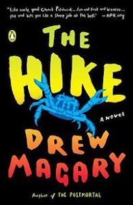
The Hike by Drew Magary
Maybe I’m being nitpicky here, but I loved the original cover because it had so many bizarre characters and illustrations that all made sense by the time you finished the book. And now, the entire story is just represented by the crab.
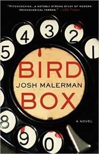
Bird Box by Josh Malerman
Look, you don’t mess with perfection, and the hardcover edition of this book was perfect. The paperback cover doesn’t make a ton of sense.
The Shadow Speaker by Nnedi Okorafor
Okay, this one has a story behind it, and for the record, I really like the final cover design. But when the cover of this book was designed, Nnedi Okorafor recounts that the publisher completely whitewashed the main character on the cover. And when she asked for a different illustration of the character, they came up with…a slightly better version that still didn’t accurately represent the character’s African roots. You can see the progression here:
Interview With the Vampire by Anne Rice
Shiny gold cover? Check. Medieval-looking script for a story that doesn’t take place during medieval times? Check. Least interesting design of all time? Check. Ladies and gentlemen, we have a winner for Most Uninspired Book Cover!
The Immortal Life of Henrietta Lacks by Rebecca Skloot
Loved the book, hate the cover. The orange is annoying, and I don’t like how Henrietta Lacks just looks like a piece of disembodied clip art.
Ring by Koji Suzuki
This is actually the book that inspired the hit Japanese horror movie Ringu and its super-creepy American remake, The Ring, but you’d never know it from looking at the cover. Although, come to think of it, that obnoxious pink will probably haunt my nightmares more than any long-haired ghost girl. Want more book covers to hate? Check out Andi Miller’s 3 Cringe-Worthy Book Covers, or Mya Nunnally’s round up of 8 Good Books With Horrible Covers. And in case you feel bad about judging a book by its cover, check out Abby Hargreaves’s post on the best book advice she’s ever received from a librarian. What bad book covers would you add to this list? *Editor’s Note: Link to the story about the cover progression of Nnedi Okorafor’s The Shadow Speaker added after publication. SaveSave SaveSave


