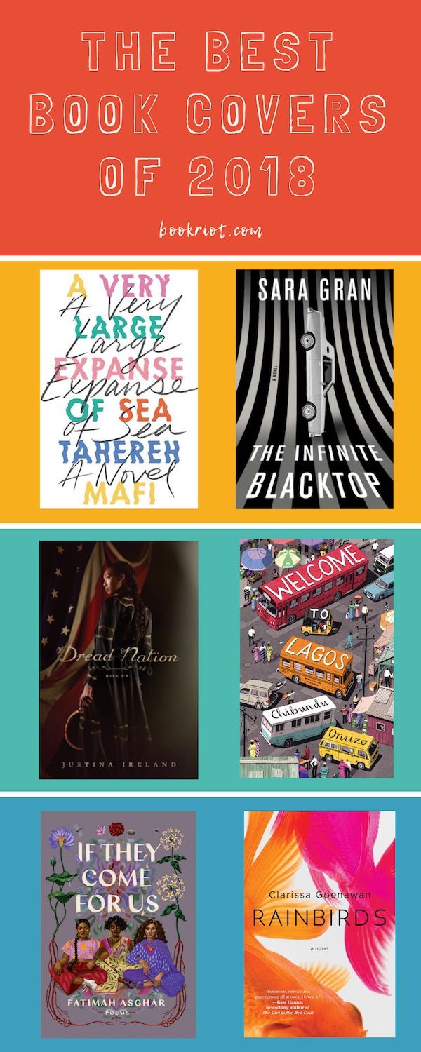
Criteria for the best book covers of the year were open to interpretation by contributors to Book Riot. Each contributor could choose up to two covers, ranging from hardcovers to individual comic issues. What emerged was a collage of beautiful, creative, and engaging covers. Don’t see your favorite cover from this year on the list? Tell us about it in the comments!
As best as possible, cover designers and artists have been credited. In some cases, tracking down that information proved challenging, so if you’re aware of who the geniuses behind any of the uncredited book covers are, please let us know. Without further ado, in no particular order…
The Best Book Covers of 2018
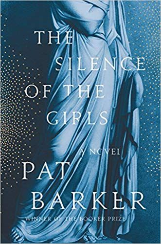
The Silence of the Girls by Pat Barker, Jacket design by Emily Mahon
The digital version of this book cover doesn’t do justice to the real thing. The elegant draping of the stone dress, the stormy blue palette, and the metallic copper flecks that concentrate in a flurry of color on the spine are absolutely gorgeous. And then, of course, there’s the clever layering of the letters behind the folds of cloth. The overall effect is stunning and evocative. —Kate Scott
My Sister, the Serial Killer by Oyinkan Braithwaite, Jacket design by Michael J. Windsor
This is a stunner! It’s gorgeous, and the reflection in her glasses is scary, and the use of fluorescent green is amazing. I mean, how often do you see fluorescent green on a book cover??? Spoiler: Hardly ever! It’s a bright, hot punch to your brain, just like the book itself. —Liberty Hardy
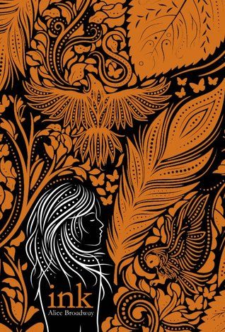
Ink by Alice Broadway, Illustrated by Jamie Gregory and designed by Andrew Biscomb
The first in a trilogy from the UK—but published through Scholastic Press in the U.S.—this cover is absolutely stunning and the sequel, out in 2019, is just as eye-catching. Besides making brilliant use of contrasting colors, the images that are peppered between the orange and black use white space in clever ways. How many different features are there? I spot an owl, a giant feather, a snake, butterflies, and a hawk. I’m also smitten with how tiny the title of the book is, in an unassuming all lowercase font. —Kelly Jensen
Infinite Blacktop by Sara Gran, Jacket Design by Alex Merto
This one I love for several reasons. 1. The car standing balancing on its nose like a seal. It’s incredible! How often are cars facing any way but horizontal on a book cover? (Or in real life, for that matter.) 2. The vertical stripes make it trippy and fantastic, just like the novel! 3. The black-and-white stripes make me think of Beetlejuice’s suit. That pleases me. —Liberty Hardy
Period Power: A Manifesto for the Menstrual Movement by Nadya Okamoto, Jacket Illustrations by Rebecca Elfast
It’s pink! The title is HUGE! And, hello, this illustration of reproductive system as a hand sign is dope. As. Heck. It perfectly encapsulates the book, which covers all things period with a political focus. —Ashley Holstrom
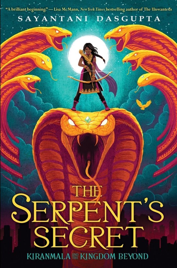
The Serpent’s Secret by Sayantani DasGupta, illustrated by Vivienne To and designed by Elizabeth Parisi
I could stare at this cover all day long. It’s bold and colourful, and has a brown Bengali girl wearing Desi clothes and holding a bow and arrow front and center! —Adiba Jaigirdar
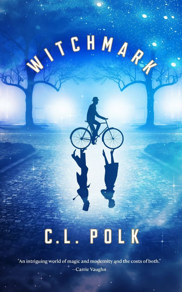
Witchmark by C.L. Polk, Illustration and design by Will Staehle
I love a cover with a flipped image, this one showing a well-dressed man and woman on one side and a bowler hat-wearing man bicycling on the other side. The colors and rainy arc of tree branches in the London mist makes me think of Mary Poppins (that scene with Mr. Banks, anyone?) and then all I want to do is put this book into my eyeballs. —Aimee Miles
Dread Nation by Justina Ireland, Jacket Design by David Curtis
The bloody sickle is held loosely, Jane’s stance is casual but cautious, as though she’s listening for a threat, but she’s also sure she can handle it. The dark folds of her dress, the smooth bumps of her braids, contrast with her bright face, all framed in front of a fallen American flag. It hints at so many parts of the story without giving anything away. —Aimee Miles
Buddhism for Western Children by Kirstin Allio
Extremely eye-catching, the many, bright eyes of the peacock feathers that wind across the cover command my attention each and every time. —Michelle Anne Schingler
Welcome to Lagos by Chibundo Onuzo, Illustration and Design by Bill Bragg
An active city scene catches colorful cars and buses at a bustling cross-section. The novel is active even before page one. —Michelle Anne Schingler
The Hazel Wood by Melissa Albert, Designed by Anna Gorovoy and illustrated by Jim Tierney
The cover is like the fairytale in the novel, with two circular paths running through the city and through the woods, and all the obstacles along the way. My favorite image is of the knife dripping blood. It perfectly sets up that this is no happy-go-lucky walk in the woods—the cover is as dark and brilliant as the book. —Margaret Kingsbury
The Poet X by Elizabeth Acevedo, Designed by Erin Fitzsimmons and Art by Gabriel Moreno
The cover is a work of art. THE HAIR. It’s gorgeous. I love the layer of words flowing from her mind through her hair and out of the cover. The paint splatters are vivid, Xiomara’s eyes are so soulful. It’s perfect. —Margaret Kingsbury
Mr. & Mrs. American Pie by Juliet McDaniel, Design by Lauren Harms
I LOVE this cover—it’s so bright and eye-catching, but also so clean and fresh. Plus it tells you a lot about the protagonist, a former beauty queen with a love of martinis and a heart of gold. I also love it because my dog did a great impression of it. Good doggo!
—Susie Dumond
The Map of Salt and Stars by Jennifer Zeynab Joukhadar, Jacket design by Sandra Chiu
Lookit! So pretty! The beautiful sky and landscape framed by the pointed arch and tiling is stunning, plus I love the shadow Arabic under the English title. A gorgeous cover perfect for a gorgeous novel. —Susie Dumond
Summer of Salt by Katrina Leno, Designed by Alison Donalty and Michelle Taormina and Illustrated by Jessica Singh
Two adorable girls snuggling on a beach. I’m sold. —Rachel Rosenberg
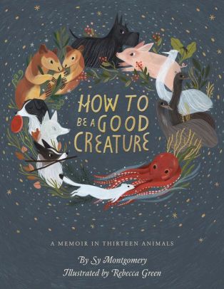
How to Be a Good Creature: A Memoir in 13 Animals by Sy Montgomery, Illustrated by Rebecca Green and Designed by CARA LLEWELLYN.
Illustrated by Rebecca Green, whose work I love. Cute animals in a circular nature vortex. —Rachel Rosenberg
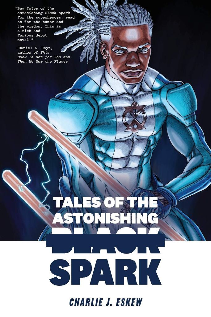
Tales of the Astonishing Black Spark by Charlie J. Eskew, Illustrated by Ron Ackins
Ahh, I love the cover for this. It shows a black superhero in a fitting costume, determined to take on the world and its ills. Absolutely gorgeous and paying homage to mainstream comic covers for trade paperbacks. —Priya Sridhar
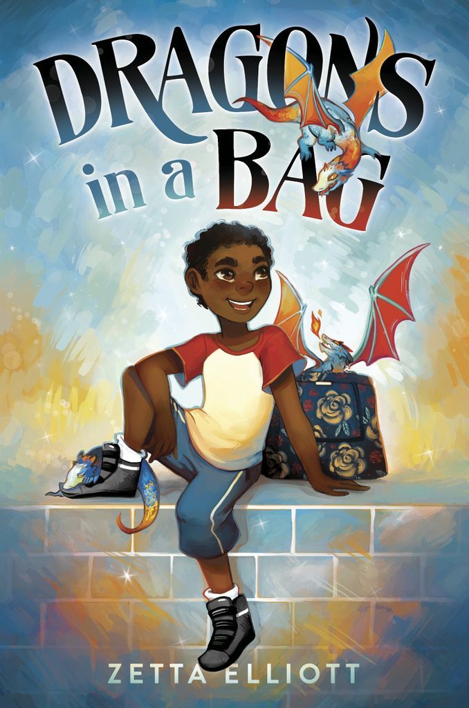
Dragons in a Bag (Dragons in a Bag #1) by Zetta Elliott, Illustrated by GENEVA B
Oh my God, this cover is super cute! We see our main character on the cover, with a dragon. What’s more, he is a black kid that is going on this wild, fun adventure! I’ve been waiting for this book for the past few years, and I want to join the ride. —Priya Sridhar
A Very Large Expanse of Sea by Tahereh Mafi, Designed by Rodrigo Corral Design
I think the simplicity of this cover is what makes it so lovely. The cursive script overlaid on colorful text that almost looks like it’s being viewed through water is so impactful against the white background. It’s one of those covers I can’t stop staring at—it’s just so pretty! —Rachel Brittain
Man-Eaters #2 by Chelsea Cain, Kate Niemczyk, Lia Miternique
Listen, there’s a tampon on the cover of a comic book, which is all I need to say! —Jamie Canaves
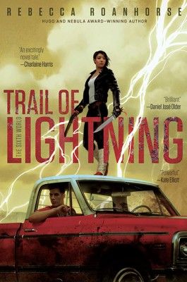
Trail of Lightning by Rebecca Roanhorse, Illustration by Tommy Arnold and Design by Nick Sciacca
Any time someone mentions this book—which is often because it’s awesome—the cover vividly pops into my brain. It’s like a movie poster for a blockbuster that you just can’t wait to see, and then after you see it you put the poster up on your bedroom wall! —Jamie Canaves
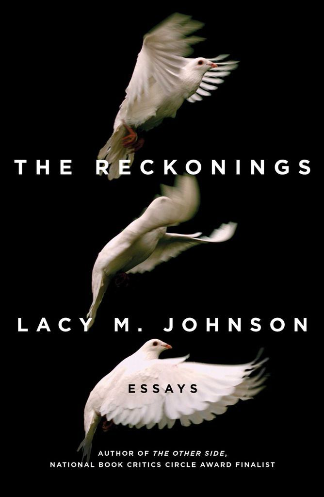
The Reckonings by Lacy M. Johnson, Jacket Design by David Litman
The Reckonings is a collection of essays about the nature of justice, written by a woman who was raped and nearly killed by a former partner. The striking cover image—three birds in mid-flight—echoes Johnson’s essay “The Precarious,” in which she draws parallels between gun violence, photography, and vulnerability. She starts with a story about quail hunting with her father as a child and ends with a moment where she felt like a bird about to be shot. That image, along with the ideas from all the essays, have been circling in my mind since I read an ARC of the book in June. —Emily Polson
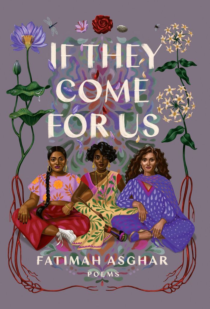
If They Come for Us by Fatimah Asghar, Illustrated and Designed by Shyama Golden
This debut poetry collection centers on the author’s experiences as a young woman with Pakistani-Muslim heritage living in modern America. I love how this cover puts three women of color front and center, united in sisterhood and solidarity. The artwork perfectly captures the tone of the book, so if you likewise are drawn in by this incredible cover, give the poems a try (even if poetry isn’t normally your thing!). Also, check out this awesome photo of Fatimah recreating the pose with some of her friends on Instagram: https://www.instagram.com/p/Bmb5RAElTYy/ —Emily Polson
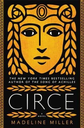
Circe by Madeline Miller, Designed by Will Staehle
This incredible retelling of the story of Circe and her banishment from her family of gods was a must-read for most bookish people this year. Miller’s language lends a strength and poetry to Circe’s tale that inspires sympathy, but not pity, for the famous witch’s plight. The bold metallic brass depiction of Circe, framed in a crown of leaves, gives the reader a glimpse into the unyielding character and the epic story within its pages. Mythology at its very best told. —Elizabeth Allen
Tyler Johnson Was Here by Jay Coles, Designed by Marcie Lawrence and Art by Charlotte Day
The last two years have been huge for books about police brutality and Black Lives Matter in young adult lit, from The Hate U Give to Dear Martin to All American Boys. While those covers had their own strengths, nothing quite blew me away like Jay Coles’s debut Tyler Johnson Was Here. It’s totally genius from a marketing perspective, with a design that screams aesthetic (though the Instagram tag is woefully underused). But more importantly, the cover of Tyler humanizes its subject and plays with seeming contradictions in a way that the others do not. The look the cover’s subject throws over his shoulder combined with a floral print that brings Kehinde Wiley’s work to mind is striking and brings the potential reader to ask all sorts of questions. And those questions are what bring you to open the book and start on a heartbreaking and all-too-real story. —Abby Hargreaves
Emergency Contact by Mary H.K. Choi, Jacket Design by Lizzy Bromley
I saw this cover, died, and came back to life so I could read the book. The designers really mastered a balance of soft and bold here, with its rosé-colored background, inky black illustrations of the two main characters, and title in shiny gold lettering. There’s also plenty to be said about the positioning of the two subjects—back to back, comfortable, cell phones up—and their details, like Sam’s tattoo sleeves and Penny’s painted nails. The whole thing is a masterpiece and I won’t hear otherwise, particularly as it celebrates connecting through technology—just as the story does, which as a society we do all to infrequently. —Abby Hargreaves
The Brightsiders by Jen Wilde, Designed by Becca S. on Swoon Reads
This books is one of the best books I read this year, but also one of the prettiest! I think this cover is totally on point and perfectly matches the content of the book. The main character is a bisexual pop star and the cover model looks the part to a T. Not only so, but her hair is the colours of the bisexual flag and her purple lipstick is totally badass. —Beth O’Brien
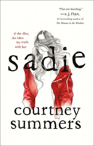
Sadie by Courtney Summers, Designed by Kerri Resnick
With an inconsistent mother, Sadie must take up the role of protective provider for her younger sister Mattie. Then, when Mattie is found murdered, Sadie disappears without a trace. The tale is twisted and twisting and the sketched image of a girl with hair blowing in her face, a red jacket the only thing bright, is what one can imagine someone sketches of a person they don’t quite know, someone with a face they’ve never looked closely at, someone whose face is easily forgotten. Sadie tells the heartbreaking story of lost, forgotten girls and the front cover reflects this well. —Abigail Clarkin
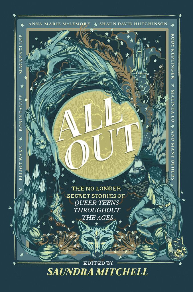
All Out: The No-Longer-Secret Stories of Queer Teens Throughout the Ages edited by Saundra Mitchell
Not only is this one of my favourite reads this year, it’s also just a joy to look at. The intricate illustrations spilling out over the border combined with the blue and metallic color scheme completely draws me in. Even as I look at it now, I can pick out more details from the stories woven in. —Danika Ellis
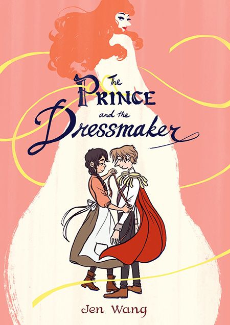
The Prince and the Dressmaker by Jen Wang
This heartwarming genderqueer love story/coming of age story/fashion extravaganza is perfectly represented by its cover. The close shot of Sebastian and Frances shows the trust and intimacy of their friendship, while Lady Crystallia is somehow simultaneously dominating the cover and blending into the background. That tension is a fitting introduction to this engrossing tale. —Danika Ellis
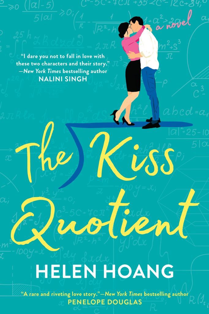
The Kiss Quotient by Helen Hoang, Designed by Colleen Reinhart
A unique cover for a unique book. The vibrant color scheme is congruous with the book’s adorable premise, and the textured teal background of algorithms is not only a shoutout to Stella’s penchant for numbers, but on a deeper level, speaks to Michael and Stella’s didactic relationship. Their chemistry is on point and they balance each other out, but really if we strip down the frills of their relationship (pun intended) and get down to the science of it (literally!), this cover displays all the ways Michael and Stella meticulously add up. Their love is as undeniable and irrefutable a fact as 2+2=4, and really it doesn’t get any more romantic than that. “The Kiss” in the title resulting in the couple’s union as the quotient is the icing on the top of the cake. —Kamrun Nesa
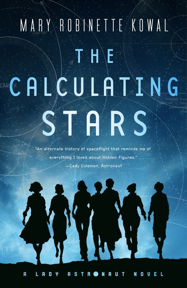
The Calculating Stars by Mary Robinette Kowal, Designed by Jamie Stafford-Hill
Kowal’s novel about an alternative world where a meteor hits the United States in 1952, expediting climate change as well as the space race towards colonization off earth, is a stunning rush of intersectional feminism. It took me entirely by surprise with its superb alt-history approach. Elma York is a Jewish ex-pilot and calculator struggling with anxiety who wants to fight for the space program to be open to all. Throughout the duology, she must confront her white privilege, and the diverse and constantly compelling cast shows the world as it really was in the 1950s while its characters strive to make their society better while struggling to escape the planet. This book was simple, but summed it all up for me: the women walking forward towards us, some of them appearing to be hand-in-hand, but all of them walking with powerful, long strides, off to conquer, off to insist, off to stand up to patriarchal structures. —Leah Rachel von Essen
Blanca & Roja by Anna-Marie McLemore, Designed by Danielle Mazzella di Bosco
I always saw the roses, but it wasn’t until I held the book in my hands that I saw the two swans, intertwined in the red and white of this stunning cover. The surrealism and beauty of the cover perfectly captures a tale that retells a mixture of Swan Lake and the fairytale Rose Red and Snow White—the roses, the forest, the swans. The novel is one of my favorite of the year, with its superb nonbinary trans representation, its soft boys and tough girls, and its story of sisterhood, love, and magic. —Leah Rachel von Essen
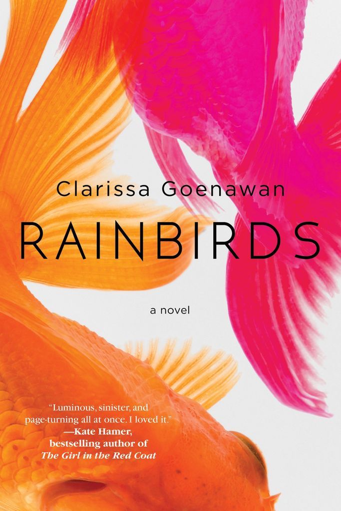
Rainbirds by by Clarissa Goenawan, Design by Janine Agro
I love an image that makes you look twice. In this case, it seems like it’s obvious: goldfish. But the top goldfish is actually bright pink and the book itself recalls birds, no fish. The juxtaposition of these elements really brings the entire cover together for me. —Kelly Jensen Love cover design talk? Check out these Instagram accounts that celebrate cover art, give a follow to these 23 cover designers on Instagram, then poke around at some of the killed cover concepts for books you know well by another look.
